I am currently re-writing this page: use the refresh button
in your browser to see if it's finished, yet.
Week 11: Responsive Design, Flex Box
In this lesson, you'll learn about responsive design and why
it's important, and what modern techniques we use to create
responsive web sites. Then you'll learn about one of those
techniques: the CSS FlexBox.
Complete
this week's worksheet.
Note that worksheets can be completed during class or after class.
They can be completed using your own lecture notes or from the provided
materials. Worksheets are not directly graded, but the questions might
appear on exams and other evaluations. Ask the professor if you would
like feedback on your worksheet (you must make an attempt on the
worksheet in order to receive feedback).
Answer the following questions where you take your
class notes (form your answers using YOUR OWN WORDS; you might have
to search for answers in the resources above).
Feel free to DISCUSS the answers with your classmates.
What does it mean to make a page responsive and why
is it important?
What is fixed design, fluid design, adaptive design, and
responsive design?
What is the "viewport"? What is the difference between the
layout viewport and the visible viewport?
What does the viewport META tag do and why is it important
for mobile devices?
What is a flex box? Why might you use a flex box?
How do you create a flex container? What is the flex-flow
property? How does it work?
What properties can you use to change the alignment of
items in a flex box?
What is the flex-basis property for? How can you
make a flex item grow or shrink?
What is the flex shorthand property for and why should
you use it?
How do you align/justify individual items inside a flex
container?
Practice Exercises
Note In the practice exercises, elements are referred to in all-caps, e.g.
FOOTER refers to the <footer></footer>
element (or it could also refer to an opening <footer> tag or closing </footer>
tag, you will know by the context in which it's used).
For each exercise, validate the HTML using the HTML Validator. Fix all
problems until you get no errors.
If you haven't already done so, create a sub-directory in your
local workspace and in your server workspace (off /syst10049)
called "week11". Feel free to add an extra level for all
of your practice exercises (e.g. /exercises).
For each practice exercise in each lesson, you'll usually
be asked to create an exercise directory for that
project, such as "/exercise1".
It is assumed that you will create the exercise
project directory in both your local workspace and in
your server workspace using the appropriate and standard
directory structure discussed in class.
FlexBox: Edit the codepen below so that the 3 boxes are centered inside the outer DIV,
both vertically and horizontally (the screen shot shows you how it SHOULD look)
The three inner DIV elements should be centered both vertially and
horizontally
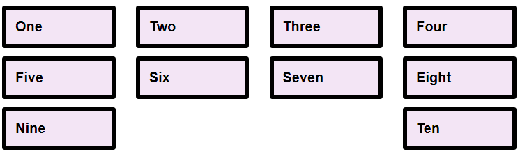
Create a new project directory called "exercise2" and add an index page
and an external CSS file in an appropriate directory. Copy the HTML
from this CodePen
into your index page.
Add the CSS to your external CSS file to create a flex box layout that places the items
such that they appear as the image below:
10 boxes in 4 columns, the last row has boxes 9 and 10 on
the left/right edges of the container.
Other details:
The flex box is laid out in wrapping rows.
Flex items have a default size of 100px and aren't allowed
to grow, but they can shrink if needed.
I didn't set any column alignment.
Tip: Examine the last row with the 9 and 10 box. They're
not individually aligned, they're being pushed to the left
and right sides.. by what?
Flexbox: Create a new project directory called exercise3 and add an index page
and an external CSS file in an appropriate directory. Copy the HTML
from this CodePen
into your index page, and copy the CSS into your external CSS file.
Add the necessary declarations to the "main" element rule to create
a flexbox that lays out the menu/search banner as shown in the
image below
The menu appears on the left and the form is pushed to the right
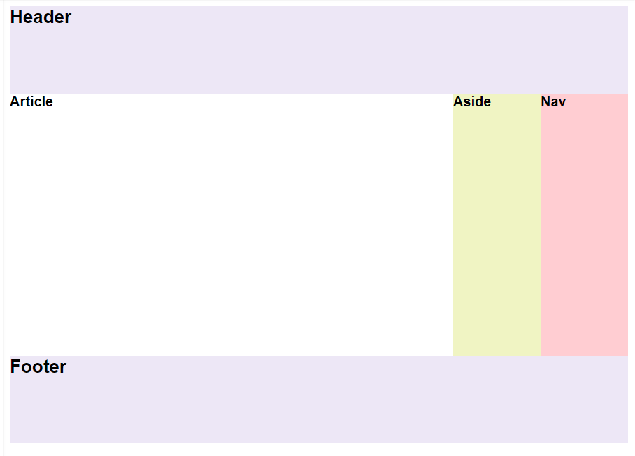
Nested Flexboxes: Create a new project directory called exercise4 and add an index
page and an external CSS file in an appropriate directory. Copy
the HTML from this CodePen into your index
page
and copy the CSS into your external CSS file. Add
the necessary declarations and rules to create
a nested flexbox that lays out a simple page in the format
shown in the image below. Some of the CSS has been written
for you.
The header and footer stay at the top/bottom and stretch
across the page. The ARTICLE element takes up any space not used by
the NAV and ASIDE elements. The ARTICLE, NAV, and ASIDE elements
are laid out in a row between header and footer.