UNDER CONSTRUCTION
I am currently re-writing this page: use the refresh button in your browser to see if it's finished, yet.
Lesson 12: CSS Grid Layout
In this lesson, we'll continue with responsive design by learning how to lay out element using a CSS Grid.
CSS Grid
Notes
Resources
- References
- Tools
- HTML Validator - always validate all of your HTML.
- CSS Validator - always validate your CSS.
- CSS Reference Card
- The CSS Grid Generator is a fun way to try different layouts and see how you would code them.
- Articles, Tutorials
- Guides on layout from MDN: CSS Flexible Grids layout guide.
CSS Tricks: A Complete Guide to CSS Grid
Homework
Practice/Study Questions
- Complete this week's worksheet. Note that worksheets can be completed during class or after class. They can be completed using your own lecture notes or from the provided materials. Worksheets are not directly graded, but the questions might appear on exams and other evaluations. Ask the professor if you would like feedback on your worksheet (you must make an attempt on the worksheet in order to receive feedback).
- Answer the following questions where you take your
class notes (form your answers using YOUR OWN WORDS; you might have
to search for answers in the resources above).
Feel free to DISCUSS the answers with your classmates.
- What is a CSS Grid? Why might you use a Grid? How do you create a grid container?
- What are grid tracks? What are grid lines?
- How do you define rows and columns in a grid?
- What is the "fr" unit of measurement? What does the repeat() function do?
- What is the explicit grid? What is the implicit grid? How do you define the row/column height of the explicit grid? How do you define the row/column height of the implicit grid?
- What grid properties can you use to have a grid item span multiple rows and/or columns?
- What are the different properties you can use to change the alignment/justification of grid items? What are the different properties you can use to change the alignment/justification of grid tracks?
- Describe a few different situations in which you might choose a flex box over a grid. Describe a few different situations in which you might use a grid over a flex box.
Practice Exercises
In the practice exercises, elements are referred to in all-caps, e.g. FOOTER refers to the <footer></footer> element (or it could also refer to an opening <footer> tag or closing </footer> tag, you will know by the context in which it's used).
For each exercise, validate the HTML using the HTML Validator. Fix all problems until you get no errors.
- If you haven't already done so, create a sub-directory in your
local workspace and in your server workspace (off /syst10049)
called "week12". Feel free to add an extra level for all
of your practice exercises (e.g. /exercises).
- For each practice exercise in each lesson, you'll usually be asked to create an exercise directory for that project, such as "/exercise1".
- It is assumed that you will create the exercise project directory in both your local workspace and in your server workspace using the appropriate and standard directory structure discussed in class.
- Use
this CodePen. You can do the exercise in the CodePen or copy and
paste the starter code into your own project.
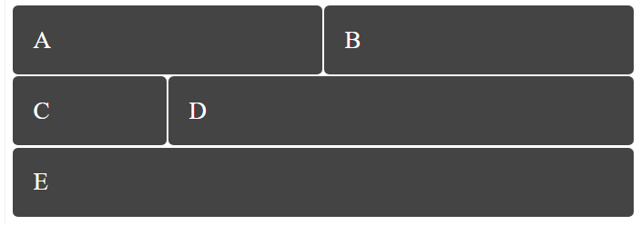
Add the CSS to create a CSS grid that looks exactly like the image below:

Row 1 contains equally-sized box A and box B. Row 2 contains box C and box D: box D is 3 times the width of box C. The third row contains box E, which takes up the width of the grid. The rows of the grid should size automatically to fit the height of their contents. There is a small amount of space between rows and columns in the grid (I used 2% of the font size, but feel free to use viewport units instead).
Note that each inner DIV element has 2 classes: the .box class and a class whose name matches the letter inside the box. Any styles added to the .box class affect all the box DIVs. To style an individual DIV, just add a class corresponding to the box letter e.g. .f { ... }
- Use this CodePen.
You can do the exercise in the CodePen or copy and paste the starter code
into your own project.
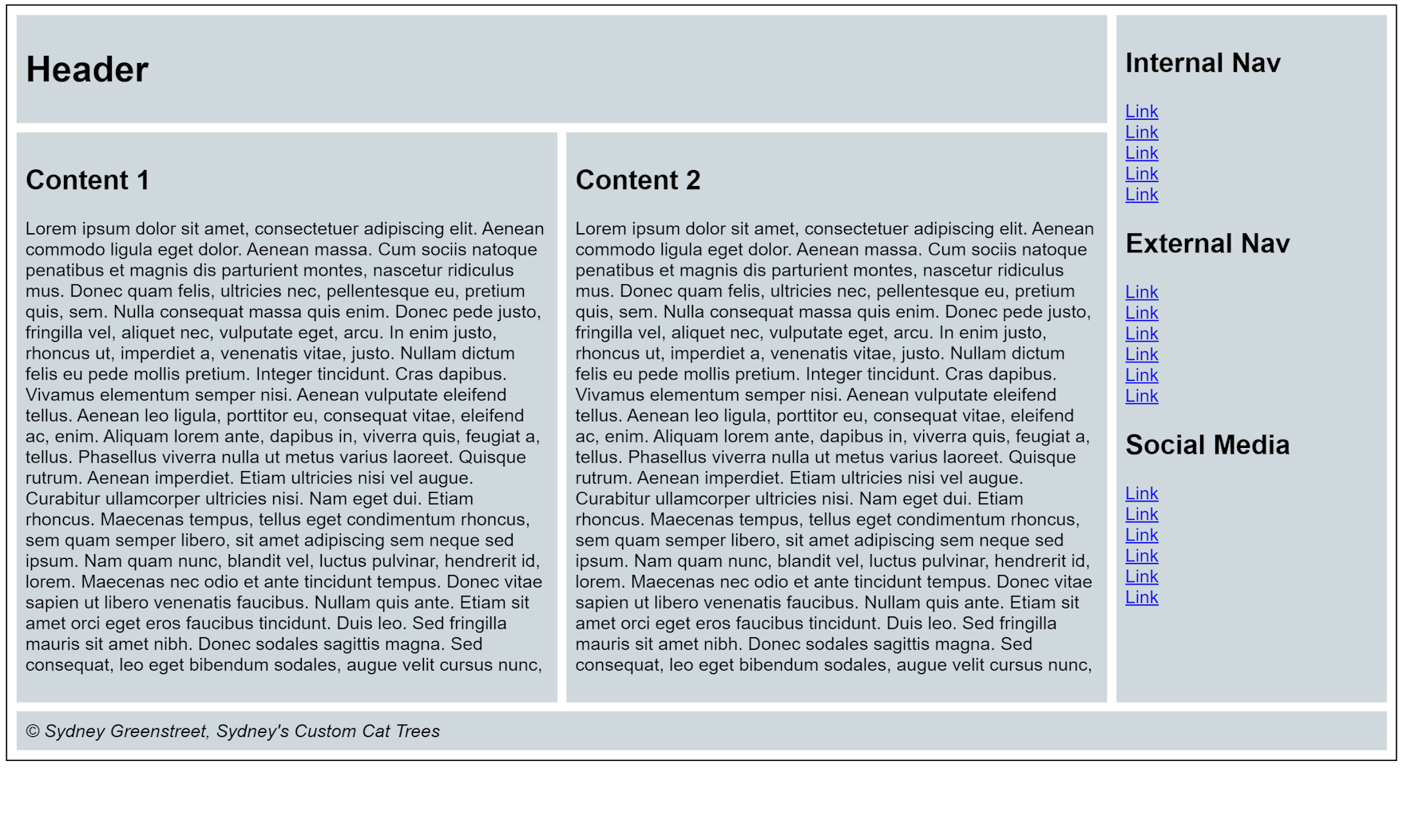
Add the CSS to create a CSS grid that looks exactly like the image below:

How the page should look The header spans across the page but stops when it reaches the left edge of the navigation element. The navigation element spans down the whole page until it reaches the top border of the footer element. The footer element spans across the entire width of the page. Between the header and footer, to the left of the navigation element are two content areas, side by side, with equal widths and heights.
Make sure you write the most efficient CSS possible.
- Nested Grid:Use this CodePen.
You can do the exercise in the CodePen or copy and paste the starter code
into your own project.
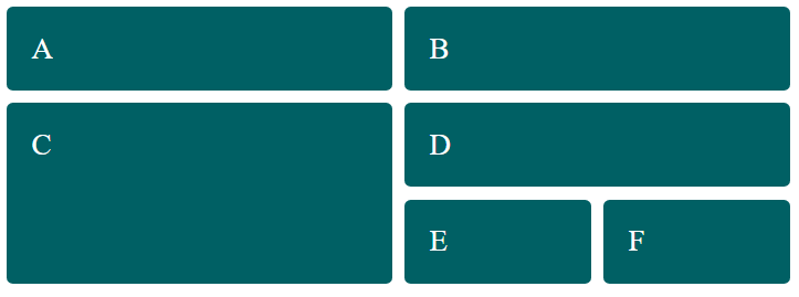
Add the CSS to create a CSS grid that looks exactly like the image below:

What your grid should look like Row 1 contains equally-sized box A and box B. Row 2 begins with larger box C, followed by a nested grid. The nested grid takes up two rows. The first row contains box D, and the second row contains box E and F, equally sized, side by side.
The rows of the grid should size automatically to fit the height of their contents. There is a bit of space between rows and columns in the grid (I used 4% of the font size).
- Combining Flex and Grid:Use this
CodePen.
You can do the exercise in the CodePen or copy and paste the starter code
into your own project.
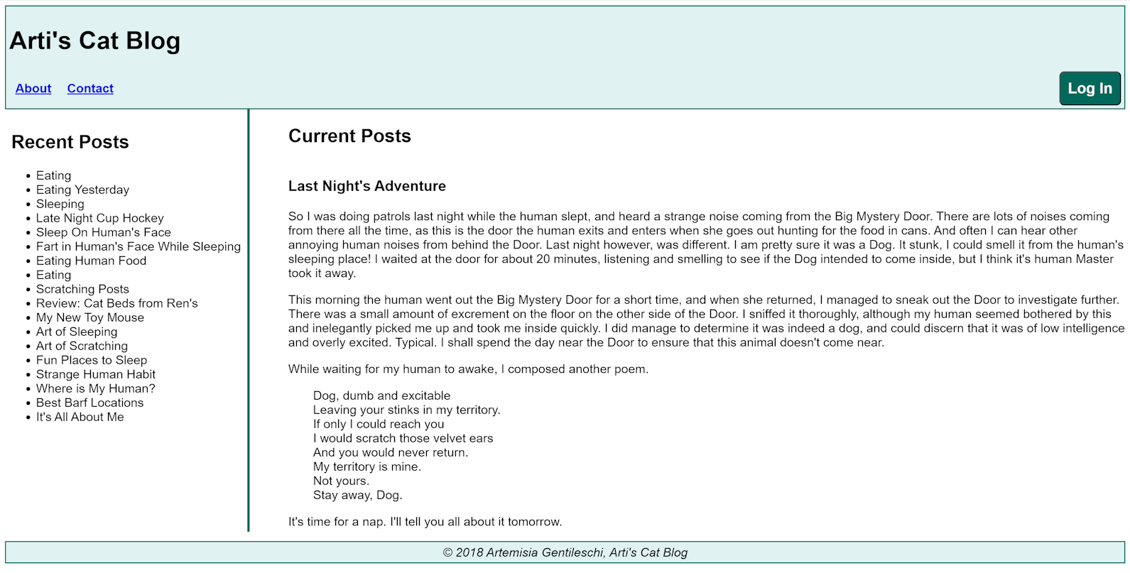
Add the CSS to create a layout that looks exactly like the image below:

What your page should look like The header and footer span across the page. The header shows the menu items on the left and the Log In button on the right. The sidebar contains a list of recent posts, and it sits between the header and footer on the left side. The main article on the page also sits between the header and footer, to the right of the sidebar. The sidebar is about one quarter width of the article area.
This uses a combination of flex box and grid. There are likely multiple solutions.