UNDER CONSTRUCTION
I am currently re-writing this page: use the refresh button in your browser to see if it's finished, yet.
Week 13: Item Visibility, Media Queries
In this lesson we wrap up the basics of responsive design: you've already
learned a little bit about the display property, but we'll
see what else it can do while we learn how to show or hide
HTML elements on the page. Then we'll learn how to write and use
media queries to display styles only when certain criteria are met.
Item Visibility
Notes
Media Queries
Notes
Resources
- References
- Tools
- HTML Validator - always validate all of your HTML.
- CSS Validator - always validate your CSS.
- CSS Reference Card
- Articles, Tutorials
Homework
Practice/Study Questions
- Complete this week's worksheet. Note that worksheets can be completed during class or after class. They can be completed using your own lecture notes or from the provided materials. Worksheets are not directly graded, but the questions might appear on exams and other evaluations. Ask the professor if you would like feedback on your worksheet (you must make an attempt on the worksheet in order to receive feedback).
- Answer the following questions where you take your
class notes (form your answers using YOUR OWN WORDS; you might have
to search for answers in the resources above).
Feel free to DISCUSS the answers with your classmates.
- What's the difference between
display: blockanddisplay: inline? What doesdisplay: inline-blockdo? - What's the difference between
display: noneandvisibility: hidden? - If an item was hidden with
visibility: hidden, how would you make it visible again? If an item was hidden withdisplay: none, how would you make it visible again? - What is meant by "mobile first" CSS development?
- What is a media query and how do they work? What are the 2 ways in which you can include a media query in your page?
- What do the media types and media features allow you to do in a media query?
- What's the difference between
Practice Exercises
Note
In the practice exercises, elements are referred to in all-caps, e.g. FOOTER refers to the <footer></footer> element (or it could also refer to an opening <footer> tag or closing </footer> tag, you will know by the context in which it's used).
In the practice exercises, elements are referred to in all-caps, e.g. FOOTER refers to the <footer></footer> element (or it could also refer to an opening <footer> tag or closing </footer> tag, you will know by the context in which it's used).
For each exercise, validate the HTML using the HTML Validator. Fix all problems until you get no errors.
- If you haven't already done so, create a sub-directory in your
local workspace and in your server workspace (off /syst10049)
called "week13". Feel free to add an extra level for all
of your practice exercises (e.g. /exercises).
- For each practice exercise in each lesson, you'll usually be asked to create an exercise directory for that project, such as "/exercise1".
- It is assumed that you will create the exercise project directory in both your local workspace and in your server workspace using the appropriate and standard directory structure discussed in class.
- Copy the HTML and CSS from the following CodePen into
a project called /exercise1:
Media Query
Exercise 1 CodePen. Add a media query that
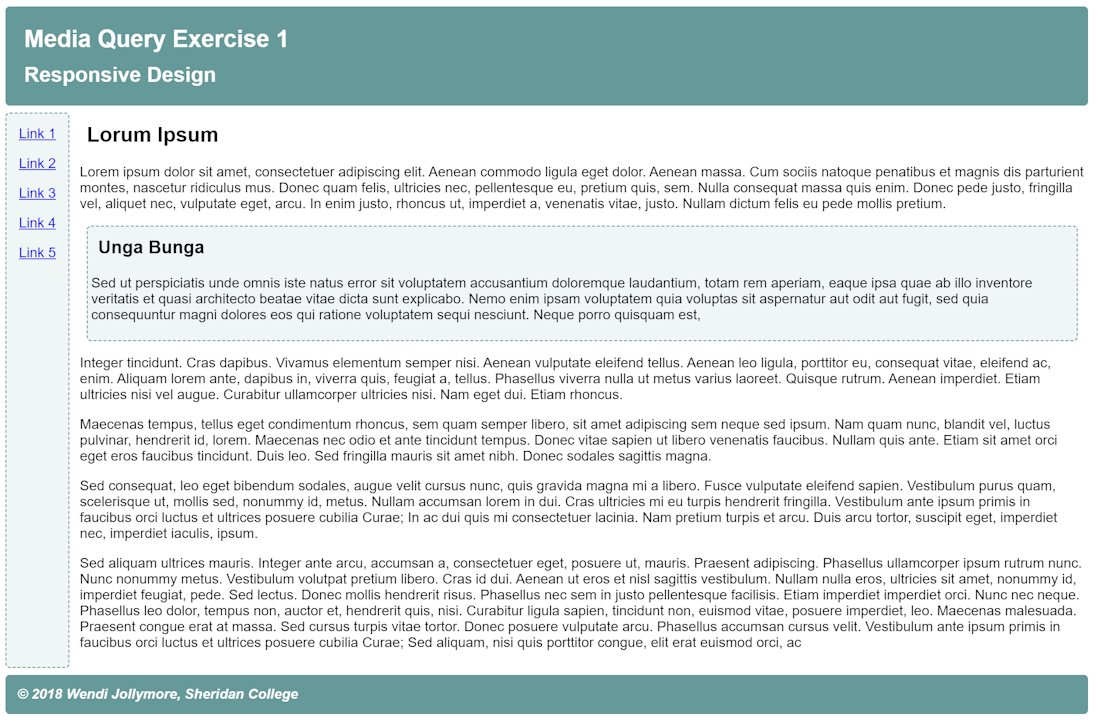
changes the layout of the page when the screen width is 1098 pixels or more,
so that it looks like the image below:
Desired result for Exercise 1 - Copy the code from this codepen for exercise 2 into a project called /exercise 2. Modify the CSS by using a media query to show the row of buttons instead of the selection list and GO button when the page is displayed on a screen that is 768 pixels or more wide.
- Copy the code from this codepen for exercise
3 into a project called
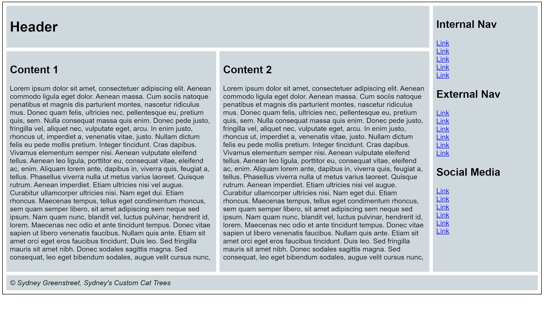
/exercise 3. Add the code to change the appearance as described below:
- By default, the layout should be a single column and the sets of
links should appear in a wrapping row.
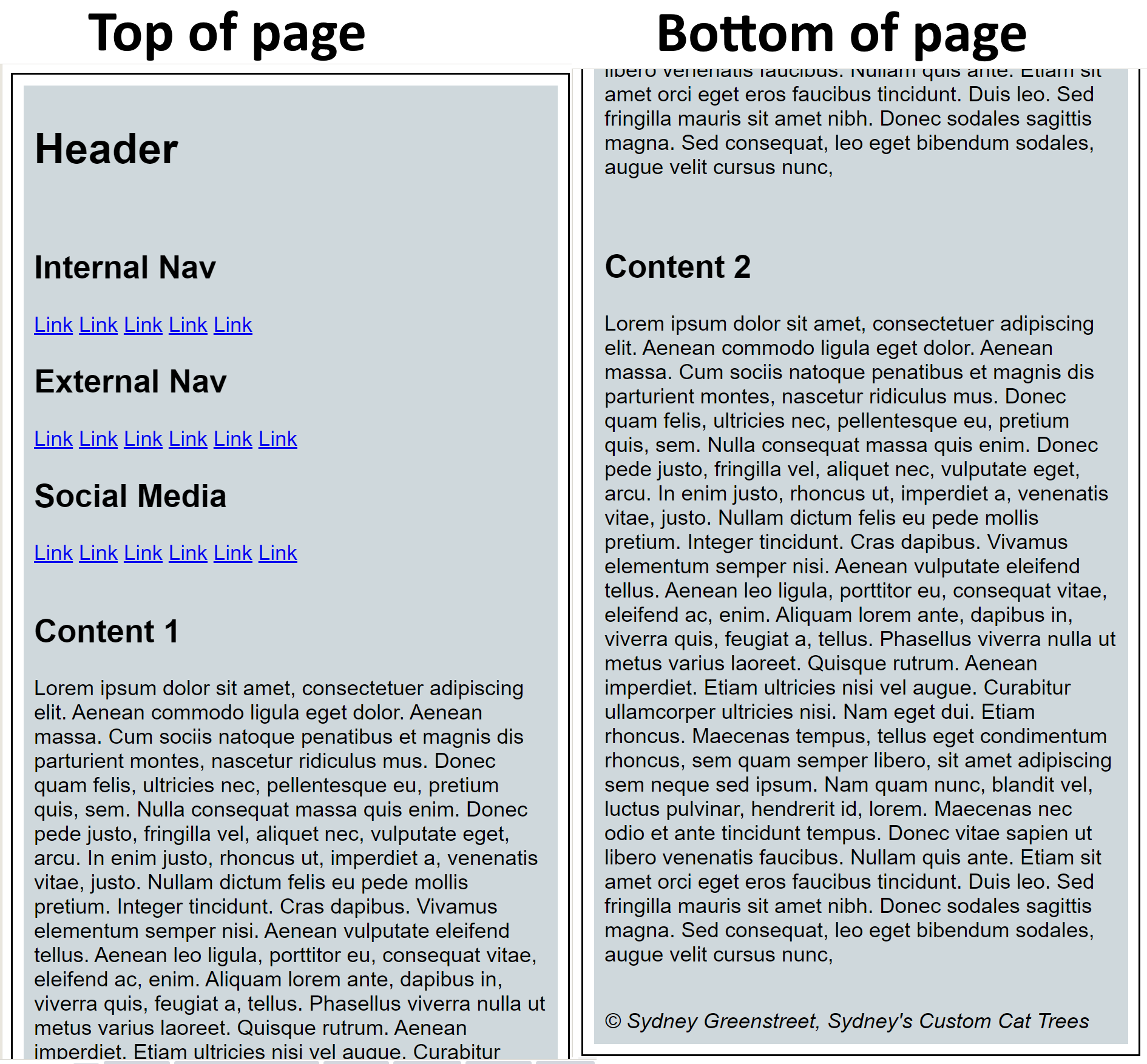
Desired result for exercise 3a - When the screen is 1098 pixels or more wide, display the page as
shown in the image below:
Desired result for exercise 3b
- By default, the layout should be a single column and the sets of
links should appear in a wrapping row.